Your website is often the first impression visitors have of your business. It reflects your brand, values, and offerings. As technology and design trends shift, a website can quickly become outdated. So, how often should you redesign your website? The answer depends on a few key factors, including industry trends, changes in your business, and the needs of your audience. In this article, we’ll break down these factors to help you decide when it’s time for a website update.
Table of Contents
Why Redesigning Your Website is Important?
Redesigning your website can improve user experience, enhance brand image, and boost search engine rankings. A modern, well-designed site is easy for visitors to navigate, builds trust, and encourages them to explore further. If users find it difficult to browse or outdated, they may leave without engaging.
According to 2023 statistics from HubSpot, 42% of people will leave a website due to poor design. Web designers note that websites should focus on both functionality and aesthetics, aiming to increase website traffic, engagement, and conversions.
Regular redesigns can also improve your website’s functionality. As new technologies emerge, an updated website will load faster, be more responsive, and work seamlessly across devices. This is especially important as mobile browsing becomes the dominant way people access the web. For businesses, a fresh design can lead to higher conversion rates, better customer satisfaction, and more online sales.
Factors That Influence the Frequency of Website Redesign
How often you should redesign your website depends on a combination of factors. Here are some key areas to consider:
a. Industry Standards and Competitors
In some industries, the changes rapidly. For example, technology companies may need to update their websites frequently to keep up with new design trends and ensure they appear modern. In other industries, such as education or government, website designs can remain effective for longer. An easy way to gauge the need for a redesign is to look at your competitors’ websites. If their sites are more visually appealing, faster, or easier to navigate, it may be time for an upgrade.
b. Changes in Your Business
When your business changes, your website should reflect those changes. This includes expanding your product line, rebranding, or shifting your target audience. If your site no longer represents what your business does, a redesign can help align it with your current goals and offerings. Additionally, if your business grows and needs new features like an e-commerce platform or a blog, a website redesign can support these changes.
c. User Experience and Analytics Data
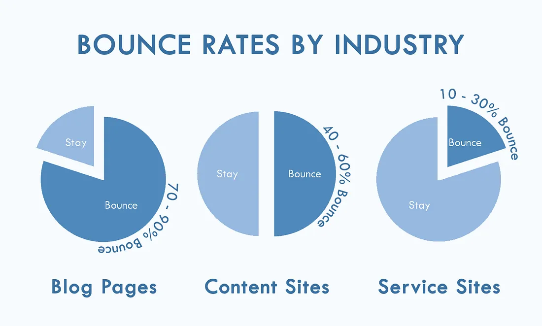
Analytics can provide valuable insights into how visitors interact with your website. High bounce rates, low time-on-site, or poor mobile performance are signs that users may not be satisfied. These issues could indicate a need for a more user-friendly design or better mobile optimization. Additionally, if your site isn’t converting well—meaning visitors aren’t taking desired actions like filling out a form or making a purchase—this might be a signal that a redesign is in order.
d. Technological Advancements
Web technologies change quickly. Updates to content management systems, plugins, or web browsers can make older websites incompatible with modern devices. For instance, if your website isn’t optimized for mobile, users will likely experience issues, and search engines may rank your site lower in mobile search results. Incorporating modern technology in your redesign, such as responsive design, can ensure a smoother user experience across all devices.
9 Key Signs Your Website Needs a Redesign
A website redesign can be costly, but the investment usually pays off in traffic, leads, and better SEO benefits. Here are nine major signs it’s time for a website makeover:
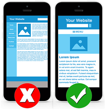
Your Website Is Not Mobile-Friendly:
Mobile compatibility is non-negotiable. If your site is difficult to use on a mobile device, users are likely to leave. UX best practices emphasize the importance of responsive design that adapts to device size.
High Bounce Rate:
High bounce rates are a red flag. They indicate users are leaving without exploring further. A high bounce rate can be due to poor navigation structure, outdated design, or slow load times.
Slow Page Speeds:
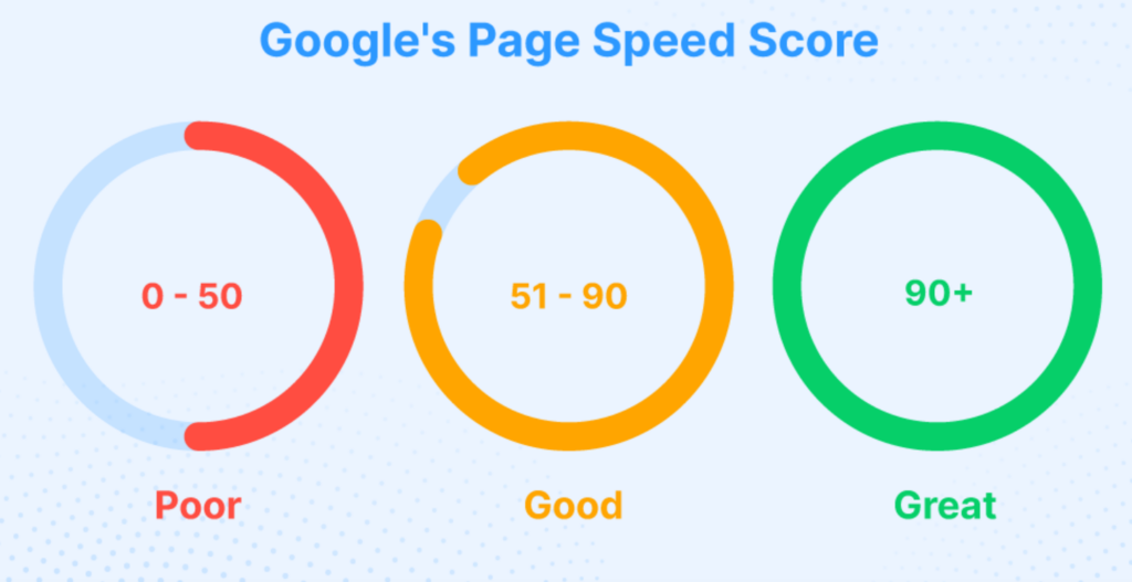
Load time directly affects user experience. Users won’t wait more than a few seconds for a page to load. Reducing image sizes, compressing videos, and limiting plugins can improve page speed. For instance, Berkshire Hathaway’s homepage screenshot is often cited as a poster child for clean, efficient design that loads quickly.
Outdated Design Features:
Outdated design elements can hurt your brand image. If your website feels like a throwback, users may assume your business lacks innovation. Web design trends shift frequently, and updating your site to meet current standards ensures credibility. Our Website Design Service can help ensure your site remains visually appealing and optimized for mobile users.

Poor Navigation:
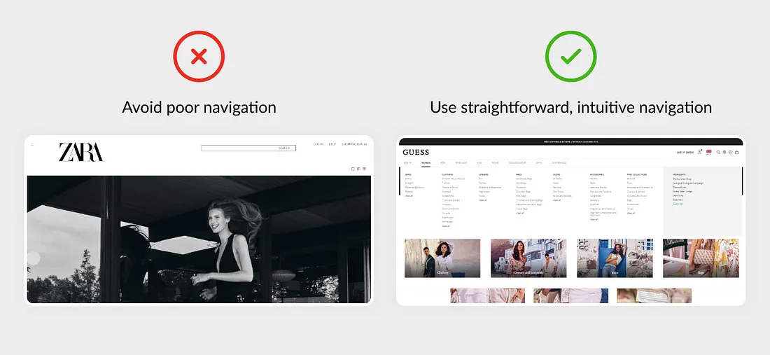
Effective navigation helps users find what they need with minimal clicks. Craigslist is a simple example of a highly functional, if somewhat retro, navigation design. Complex navigation structures can frustrate users, reducing your conversion potential.
Brand Inconsistency:
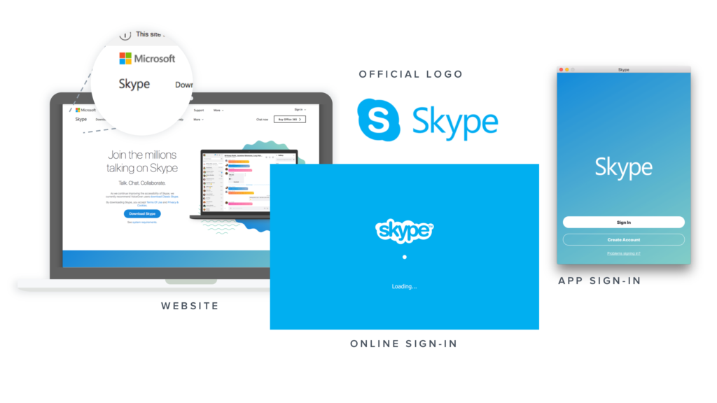
Brand inconsistency can confuse users, weakening their perception of your business. This includes color schemes, fonts, and content structure across all devices. Consistency in web content presentation builds trust and improves brand image.
Content Management Challenges:
If updating content is a hassle, it might be time to switch to a more user-friendly content management system (CMS). Content updates should be straightforward, allowing you to keep information relevant for readers.

Low SEO Rankings:
Outdated SEO practices can result in lower search engine rankings. Regularly updating content, adding relevant keywords, and aligning with search engine algorithm updates improve visibility. SEO benefits are significant when your website is optimized for search engines. Discover how our SEO Services can boost your website’s visibility and improve search engine rankings.

Visual and Functional Inconsistencies:
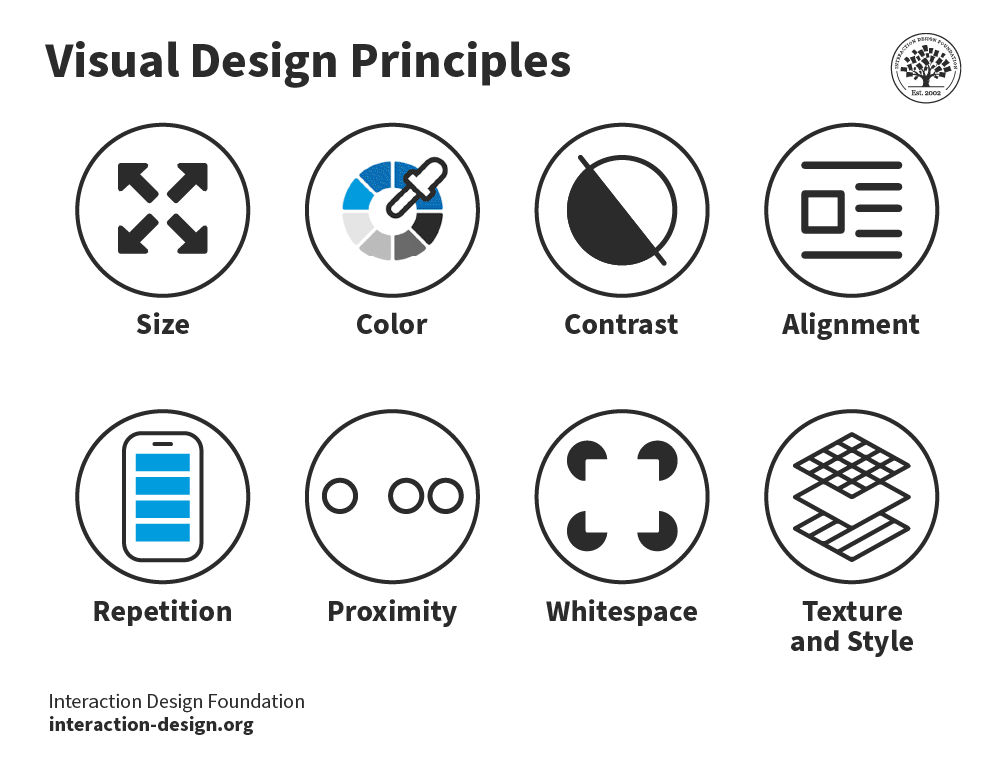
Consistency in design features across platforms is crucial. For example, a Panera Bread website experience on mobile should feel similar to the desktop version. Elements such as menu items, filters, and color schemes should create a cohesive experience.
How Often Should You Redesign?
While there’s no one-size-fits-all answer, many experts recommend a website redesign every two to three years. However, this frequency can vary depending on your industry, audience, and technology trends. Here’s a general guide:
- Fast-Paced Industries: Businesses in fast-evolving fields like technology or digital marketing may need to redesign their websites every 1-2 years to stay relevant and competitive.
- Moderate Change Industries: In industries with moderate changes, such as retail or finance, a redesign every 2-3 years is often sufficient. This ensures your site remains fresh and functional without needing constant updates.
- Slow-Changing Industries: If you’re in an industry where design trends change slowly, like law or healthcare, you may only need a redesign every 4-5 years. However, regular updates to content, images, and features are still important.
Steps for a Successful Website Redesign
A redesign can be a big project, so planning is essential. Here are the main steps:
a. Set Clear Goals
Define what you want to achieve with the redesign. This could include improving user experience, increasing conversions, or enhancing mobile performance. Having clear goals helps guide the design process and measure success afterward.
b. Analyze Current Site Performance
Use analytics tools to understand where your current website performs well and where it falls short. Metrics like bounce rate, page load time, and user demographics can reveal valuable insights. This data will help you focus on areas that need the most improvement. Studies from Google show that as page load time goes from one to ten seconds, the probability of a mobile site visitor bouncing increases by 123%.
c. Focus on User Experience (UX)
User experience should be at the heart of any redesign. Make sure your site is easy to navigate, visually appealing, and responsive across devices. Pay attention to page layout, font size, color scheme, and call-to-action buttons to make interactions smooth and engaging.
d. Optimize for Search Engines
SEO is essential for driving traffic. Incorporate SEO best practices, like keyword optimization, meta descriptions, and alt tags for images, during the redesign. Consider also using a mobile-first design, as Google prioritizes mobile-friendly sites in search results.
e. Test Before Launching
Before going live, test the redesigned site to ensure everything functions correctly. This includes checking for broken links, verifying mobile responsiveness, and testing load speeds. Collect feedback from a sample of users to ensure the new design meets their needs.
Balancing Redesign Frequency with Budget and Resources
Website redesigns require time and money, so it’s essential to find a balance. Small businesses with limited budgets might not be able to afford frequent redesigns, so they should focus on periodic updates instead. Larger companies with bigger budgets may have more flexibility to update their websites often.
If a full redesign isn’t feasible, consider making smaller updates. This could involve refreshing images, adding new content, or tweaking color schemes. Small changes can keep your site feeling fresh without requiring a complete overhaul.
Final Thoughts on Website Makeovers
A successful website redesign strengthens your site’s competitiveness by enhancing user experience, SEO, and aesthetics. Regular updates ensure your site remains credible, user-friendly, and aligned with current design standards. Assessing design, functionality, and content periodically helps maintain a fresh, appealing look that engages visitors. While a full redesign isn’t necessary every year, keeping your site up-to-date with feedback and trends is a valuable investment that attracts visitors and supports your business goals.
